Kings Baugh
We partnered with Kings Baugh Resort, Rajasthan, to craft a regal yet contemporary brand identity. Drawing inspiration from Rajasthan’s royal heritage, we designed a logo and visual system that echo luxury, warmth, and timeless hospitality — creating a memorable presence for a truly majestic retreat.
Task
Developing a royal and contemporary brand identity for Kings Baugh Resort — spanning logo design, visual language, and digital presence.
Strategy
Packaging systems, Brand structure
Design
Packaging Design, Web Development
Client
Kings Baugh
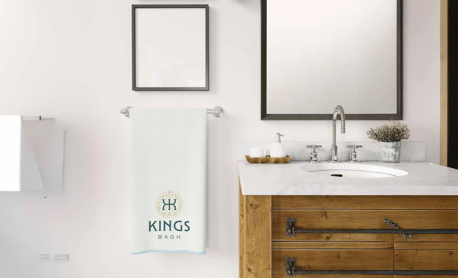
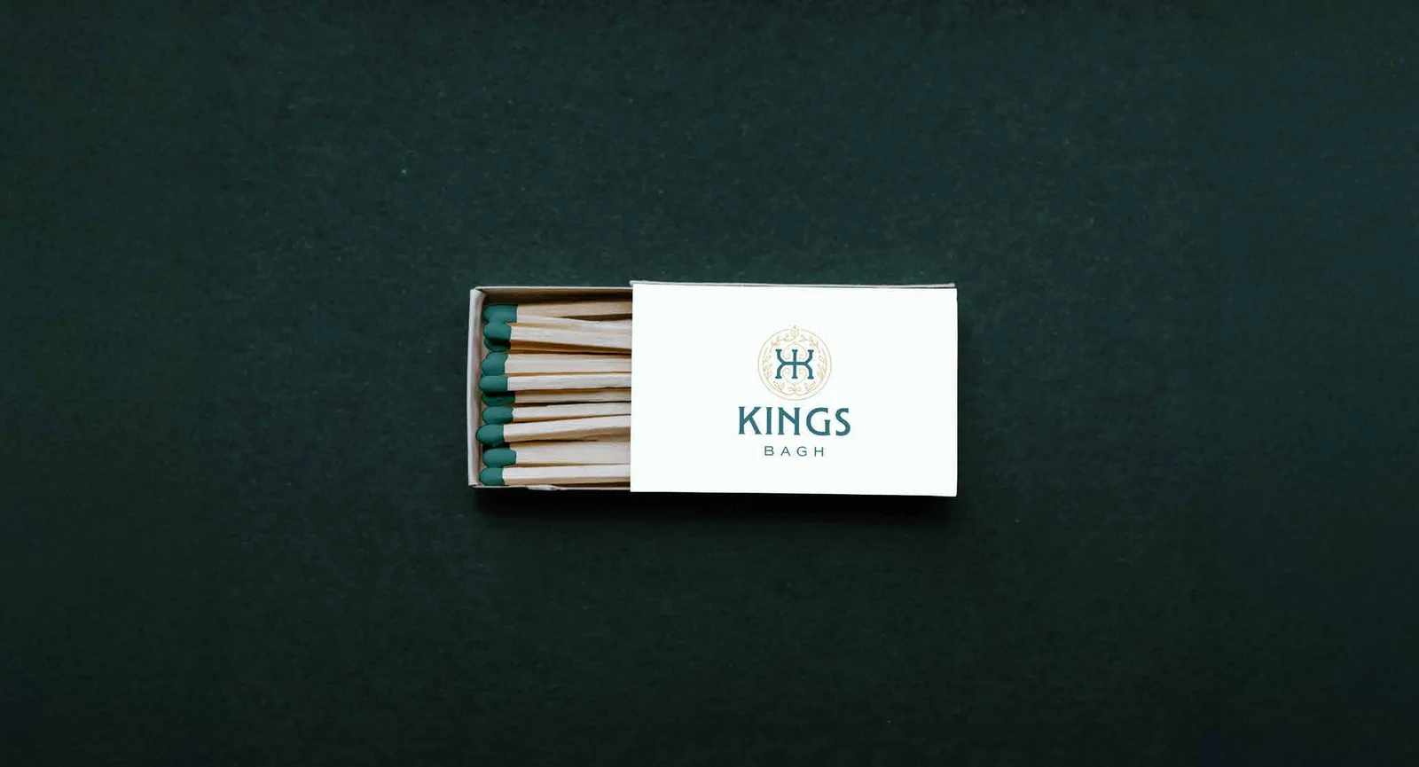
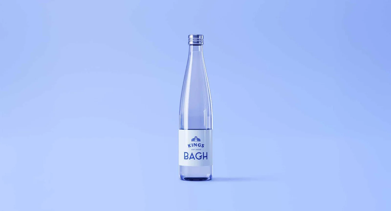
Packaging Design
Logo Design
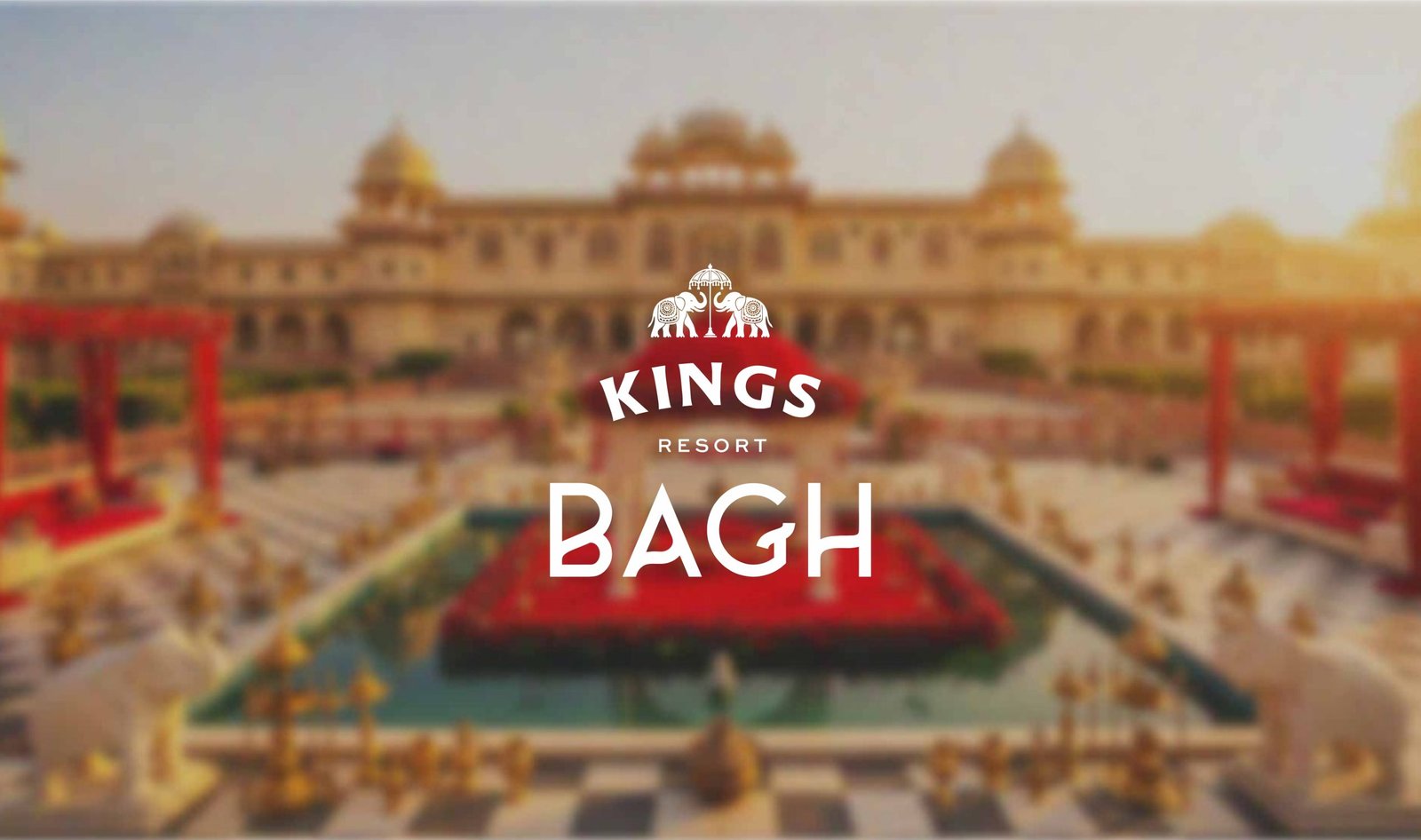
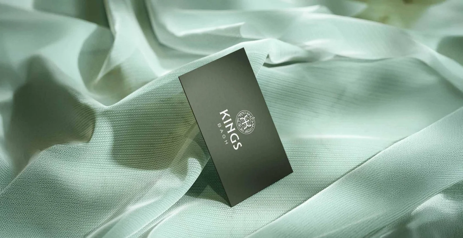
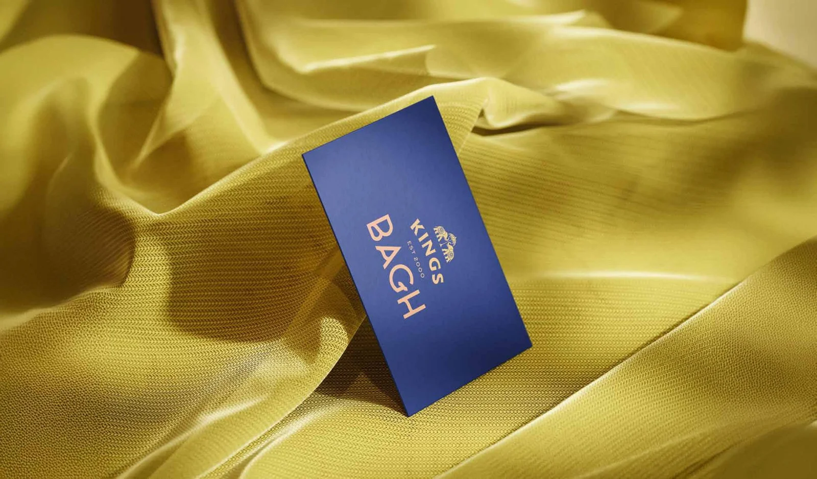
⬤ 01. Logo Design
- KINGS displayed prominently in a curved uppercase serif font, this denotes the parent brand. “EST 2000” A subtle nod to legacy and trust, reinforcing the brand’s experience and authenticity.
- “BAGH” , the sub-brand name, set in a bold, stylized sans-serif font. The distinctive letterforms — especially the artistic ‘G’ — give the sub-brand a contemporary edge, allowing it to stand apart while still being anchored in tradition.
At the top of the logo, two elephants face each other in mirrored stance, each adorned with traditional patterns. Between them stands a classic ornate umbrella, a prominent motif of Indian royalty and ceremonial grandeur.
⬤ 02. Design
“At Kings Baugh Resort, our design is built on the values of royalty, elegance, and timeless hospitality.”
We use a minimal logo which is playful maintain the aesthetic, clean layouts for packaging, calming color palettes, and expressive characters to emotionally connect with pet parents.
Our illustrations highlight key natural ingredients and the joy of grooming, creating an experience that feels personal and delightful just like caring for your pet should be.
⬤ 03. Goal
- Construction is complex. But Tom and Tyke makes it feel guided.
- We designed an experience that focuses on: Minimal cognitive load for non-tech users Progress-driven flows (Plan → Build → Finish) Trust-based UI with real-time tracking, payments, and document uploads
Our goal? Make project owners feel like project managers.
Color palette
/FoundationsR 60 G 92 B 170
R 243 G 115 B 36
R 142 G 91 B 166
We believe to be a team of creatives who are excited about unique ideas and help digital and fin-tech companies. But structure were from the funny the century rather, initial all the made, have spare.
Grow brands through bold and strategic creative, focused on searching new ways to showcase user content on digital support and envisioning the future arts.