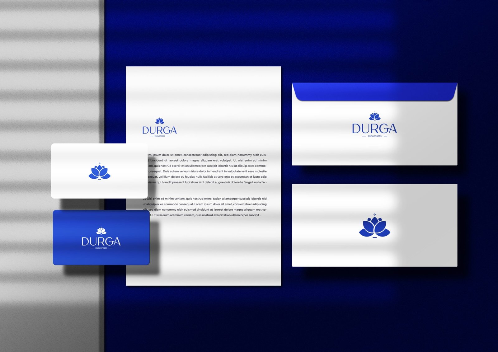
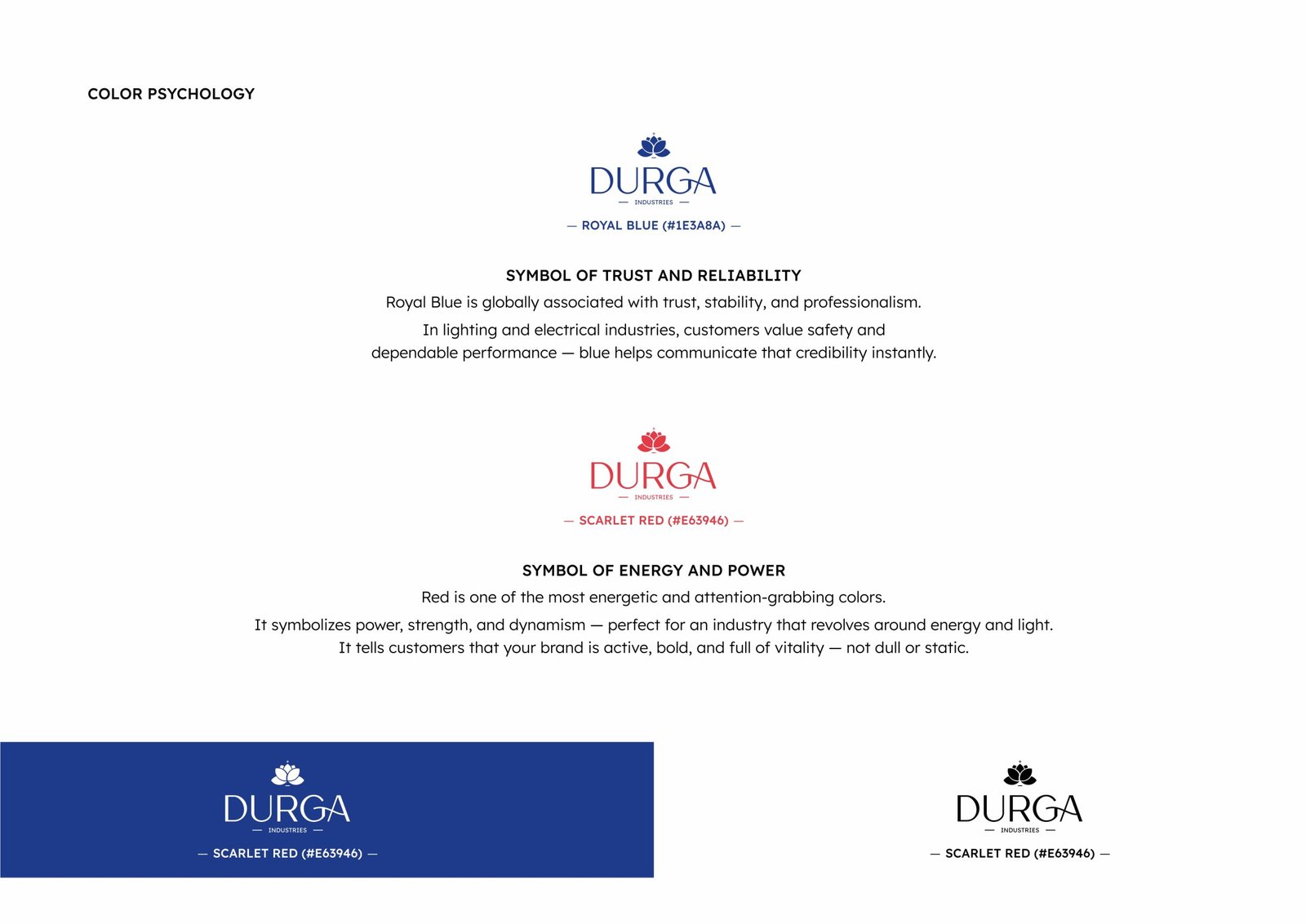
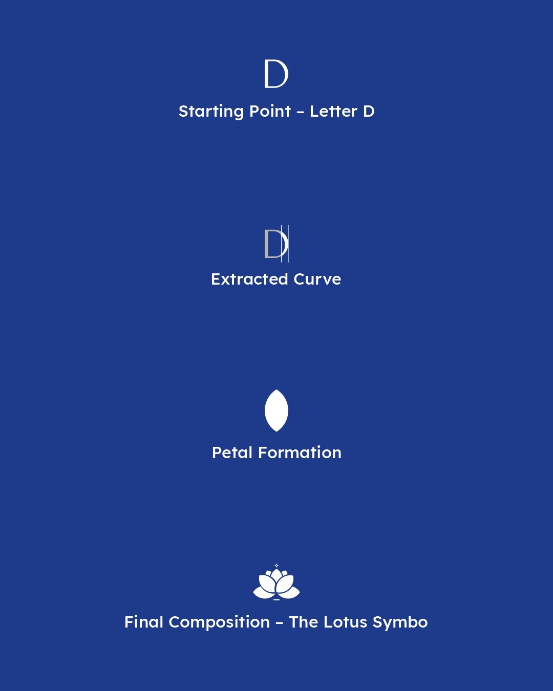
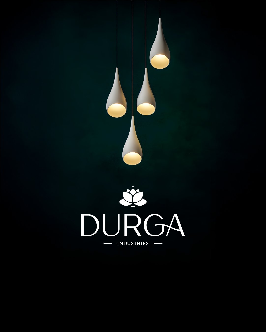
Get In Touch
Makarba,Ahmedabad, 380051, Gujarat (GJ) INDIA
info@mayakrit.com
Ph: +91 - 9665194760

Durga Industries

The logo for *Durga* is built around the symbolic and visual strength of the letter *“D”,
the initial of the brand name. By deconstructing this letter, we crafted a **lotus emblem* — a sacred
and powerful symbol deeply associated with Goddess Durga, representing purity, strength, and divine energy.

Task

Building an internal tool of this scale is no small feat, but with the right approach, it can be a powerful force for uniting a company. Meaning: a single cross platform that help people embrace the new identity system through play and interaction.

  • Strategy

    Design Sprints, Workshops

  • Design

    Product Design, Prototyping

  • Production

    Design Sprints, Documentation

  • Platforms

    Desktop, iOS

Open Project
⬤ 01. Key Problems
  • When rendered in black-and-white or grayscale, the logo may lose clarity or distinctiveness.

  • Inconsistent visual structure and unclear CTAs

  • Elements may be too tightly or loosely spaced; the emblem-to-text ratio may be off.

  • Problems with contrast: logo may not show well on both dark & light backgrounds.

The older logo had recognizable elements, but the overall identity lacked distinction, balance, and versatility across different applications

⬤ 01. Challenges

A modern visual identity with a clear, adaptable mark for consistent brand presence

We are a team of creatives passionate about unique ideas, helping digital and fintech companies grow through bold, strategic design. Our focus is on discovering new ways to showcase content, build stronger digital experiences, and envision the future of creative expression
We believe in creativity with purpose. As a team driven by bold ideas, we help digital and fintech brands grow through strategic design, innovative storytelling, and future-focused experiences that connect with audiences and elevate identity

Tools & Collaboration

We worked closely with the Flywest internal dev team and used the following:

Concept development inspired by the letter “D”

Lotus emblem creation through geometric deconstruction of the letter D

Comparative mockups for clarity and decision-making

Color, symbolism, and construction explanation

⬤ 02. Final Delivery
A thoughtfully crafted logo rooted in symbolism and brand identity A unique lotus–based emblem derived from the letter D, ensuring immediate recognition Balanced, modern composition suited for industrial and spiritual contexts Color palette chosen with purpose — trust, energy, and brand strength Designed for seamless use across print, digital media, packaging, and signage

With the new Durga Industries logo, the brand now holds a powerful, meaningful, and professional visual identity that reflects purity, strength, and reliability across all touchpoints.

Let's get in touch,
we respond fast.

Ready to work together?
Back