
Designing for Google: How UI and Content Work Together for SEO Dominance

We often think of SEO as a purely keyword-driven game — a matter of search terms, backlinks, and metadata. But in 2025, SEO is no longer just about ranking higher. It’s about delivering value once you get there. That’s where UI/UX design and content strategy step in as powerful allies.

If your website ranks high but users bounce quickly, Google takes notice. If people stay, engage, and convert, you win — both in rankings and in business. So, how do you get there?

Let’s decode the secret sauce: a design-content symbiosis built for SEO dominance.

1. SEO Isn’t Just Text — It’s Experience

Search engines have evolved. Google now evaluates a mix of Core Web Vitals, page structure, mobile responsiveness, and user intent satisfaction — all of which tie back to design.

Yes, content still needs keywords. But without a clean, intuitive interface, that content won’t be read, shared, or converted.

Great SEO today is built on how users experience your content — not just how robots crawl it.

2. Design Helps Google Understand Your Content Hierarchy

Here’s how thoughtful UI supports SEO architecture:

  • Headings (H1–H6): Clearly designed typography and spacing improves skimmability for users — and crawlability for bots.
  • Button hierarchy: Consistent CTAs (calls-to-action) in design reinforce desired actions — from clicking “Learn More” to signing up for a newsletter.
  • Breadcrumbs and navigation: Help users (and Google) understand site depth and context.

Your layout isn’t just a visual choice — it’s an information architecture decision. When your site is easy to use, it’s easier to crawl and rank.

3. Content Drives Context — But Design Drives Readability

You can have the best-written blog post in the world, but if it’s cramped in long paragraphs or poorly formatted, users will leave. That’s why design elements like:

  • Whitespace
  • Font hierarchy
  • Contrast and accessibility
  • Scroll pacing with visual breaks

…play a massive role in how long users stay and how far they read — key engagement metrics Google watches closely.

Design doesn’t just beautify. It makes content consumable.

4. Mobile UI/UX is No Longer Optional

With Google’s mobile-first indexing, responsive design is a non-negotiable. But beyond fitting the screen, your design needs to adapt the experience:

  • Ensure that menus are thumb-friendly
  • Keep CTAs clearly tappable
  • Avoid intrusive popups or slow-loading assets
  • Use collapsible sections for long-form content

A poor mobile design increases bounce rates — and that hurts rankings.

Microinteractions and Visual Cues Improve Dwell Time

When users interact with your design — hover effects, animated scrolls, tab reveals — they’re engaging longer.

Design elements that improve:

  • Time on page
  • Scroll depth
  • Interaction rate

…signal to Google that your content is not only relevant but also valuable.

Imagine a product page with strong SEO copy but no visual trust signals, awkward spacing, or confusing navigation. Now flip that: a beautifully designed page with vague or thin content. Both fail.

But when your designer and content strategist work together:

  • You craft structured, scannable, strategic content
  • You design layouts that highlight what’s most important
  • You create a site that not only gets found but turns visitors into believers

Design for people, write for people, and structure for people — and Google will reward you for it.

In today’s digital game, SEO success doesn’t live in a silo. It lives where content, design, and UX meet. The websites dominating search results in 2025 are those that understand this synergy.
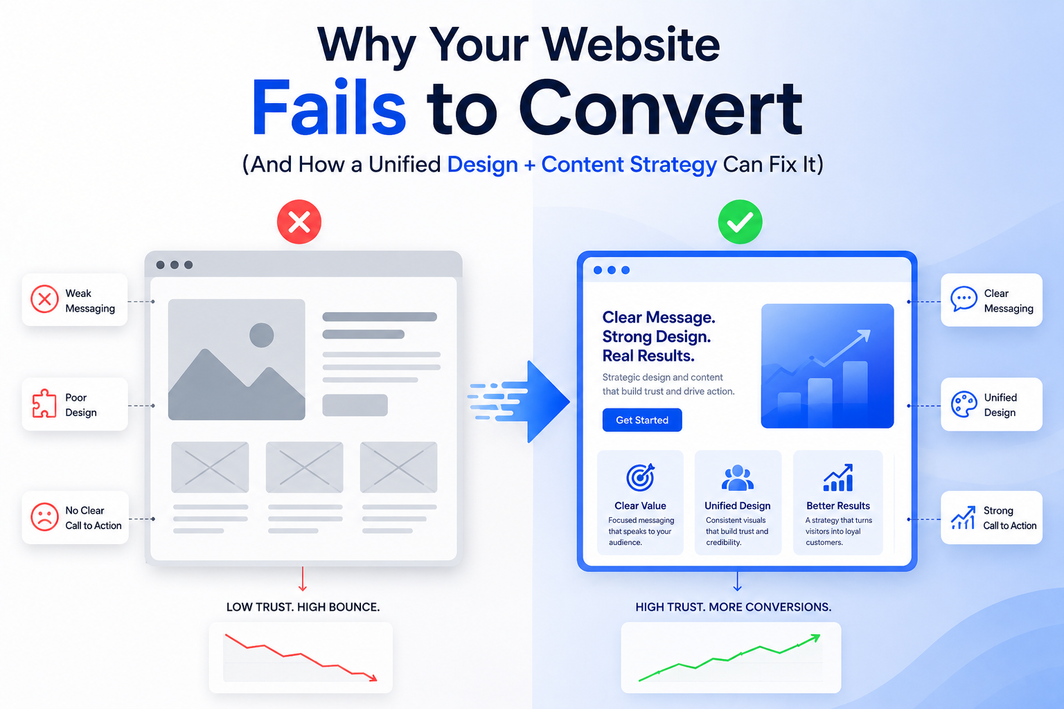
Why Your Website Fails to Convert (And How a Unified Design + Content Strategy Can Fix It)

You’ve invested in a great-looking website. It loads fast, it’s mobile-friendly, and the layout seems modern. But the conversions? Still disappointing.

Sound familiar?

The problem might not be your visuals or your offer — it’s the disconnect between design and content. In too many websites, UI/UX and copy are treated as separate silos. But in today’s digital space, your words and your visuals need to work in unison to drive user action.

Let’s explore why your site may be failing — and how a unified strategy between design and content can transform your results.

1. Pretty Doesn’t Mean Persuasive

Yes, users judge websites in milliseconds — but those judgments go beyond color palettes and fonts. If your website looks good but doesn’t guide action, it becomes just a digital brochure.

Effective websites are:

  • Clear, not just clever
  • Purposeful, not just pretty
  • Functional, not just fashionable

You need a structure that flows like a story — and copy that supports each visual cue.

2. Your CTA is Lost (Or Worse — Confusing)

One of the biggest reasons for low conversion is weak or buried Calls-to-Action.

Ask yourself:

  • Is the CTA visible without scrolling?
  • Does it match the user’s journey on the page?
  • Is the microcopy specific and benefit-driven?

Design should highlight the CTA using whitespace, color contrast, and hierarchy — while the content should clarify why the user should click.

3. There’s No Visual Hierarchy Guiding the Reader

If every headline screams for attention or every block looks the same, users don’t know where to focus. They skim and leave.

Unified design + content solves this by:

  • Using typographic scale to separate primary vs secondary messages
  • Creating scannable content blocks with strong headlines
  • Designing visual anchors (icons, illustrations, section dividers) that guide progression

When content and layout are designed to work together, users stay longer — and convert more often.

4. You’re Saying Too Much (or Too Little)

Too much copy overwhelms. Too little copy leaves questions unanswered.

A unified strategy finds the sweet spot by:

  • Mapping each section of the site to a user intent
  • Using design to chunk long content into digestible formats
  • Writing microcopy (tooltips, button labels, error messages) that reassures and supports

The best sites feel light but informative — because every word and pixel has a role.

5. It’s Not Mobile-First — It’s Mobile-Second

Google penalizes poor mobile UX — but so do users.

If your mobile site:

  • Forces users to pinch and zoom
  • Uses massive images that slow things down
  • Buries key content below long scrolls
    …you’re losing conversions daily.

Mobile-first design paired with compact, high-impact copy is essential. The content should prioritize action. The design should eliminate distractions.

6. Trust Signals Are Missing or Misplaced

Would you buy from someone who gives you no proof?

Design needs to make trust elements stand out:

  • Reviews and testimonials (with faces and names)
  • Logos of brands you’ve worked with
  • Press mentions or certifications
  • Human-centered content like a team photo or founder story

A content strategist ensures these don’t just exist — they’re woven into the flow. A designer ensures they’re seen.

7. There’s No Emotional Hook

Conversion isn’t just logic — it’s emotion.

If your design is sterile and your copy is generic, there’s no story to connect with. Your site should answer:

  • Why does this brand care?
  • What does it feel like to use this product or service?
  • Why now?

Emotionally resonant messaging, paired with warm, intentional design choices, creates moments that move users.

When content and design are built in silos, you get something that’s just okay.

But when they come together with shared goals, clarity of messaging, and intent-driven layouts — you get a conversion machine.

That’s why the best-performing websites today aren’t just “well-designed.” They’re well-composed.

So if your site isn’t converting, it’s time to stop asking what’s broken — and start asking whether your design and content are truly working together.