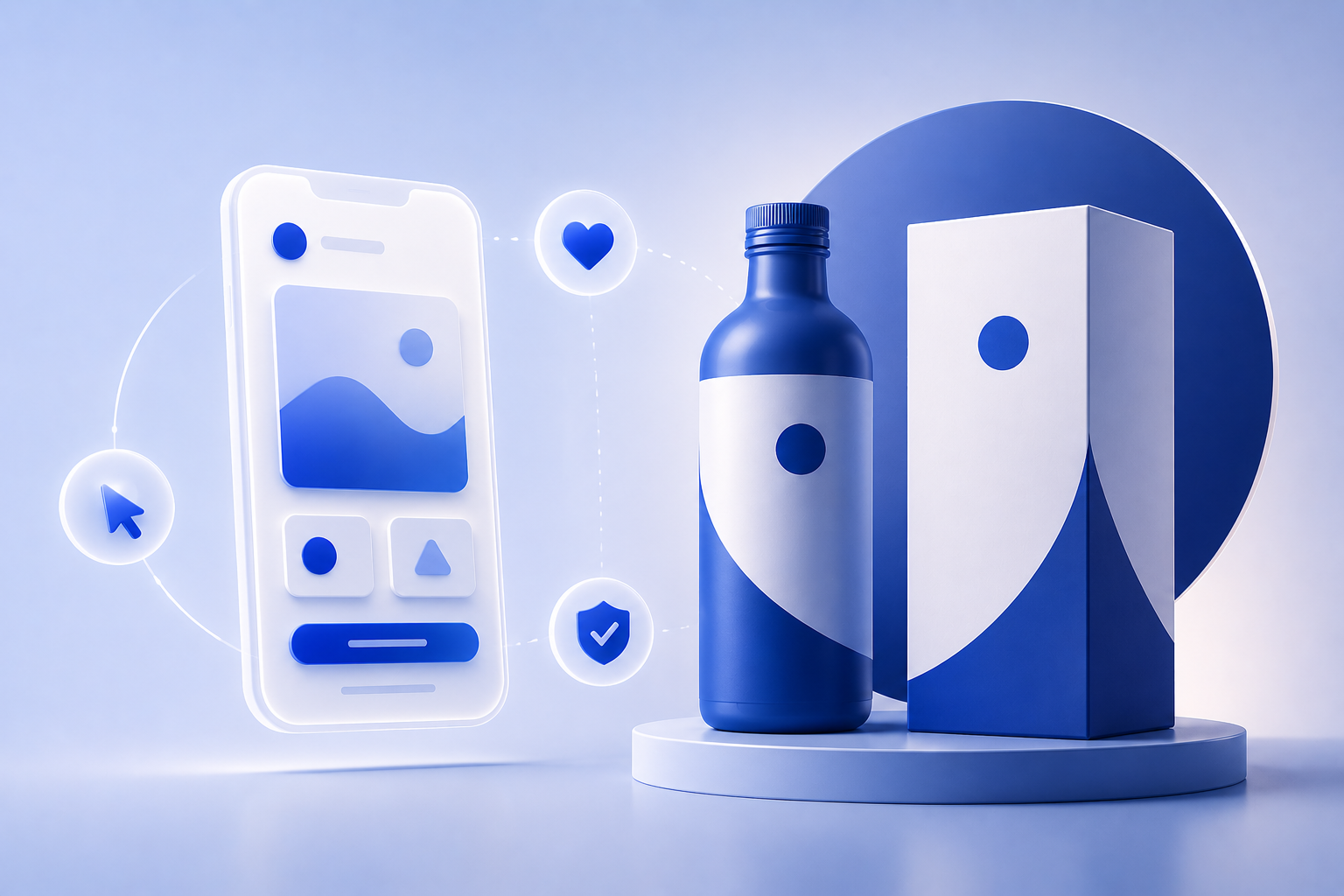
From First Click to Lasting Impression: How UI/UX and Branding Work Together to Build Trust

When a user lands on your website for the first time, the clock starts ticking. Within seconds, they subconsciously decide whether your brand is credible, relevant, and worth their time. This gut decision isn’t just based on how “pretty” your website looks — it’s a combination of UI/UX design and branding working together to create an experience that feels reliable and intentional.

So how do you turn that first click into lasting trust? Let’s break it down.

UI/UX (User Interface and User Experience) is often invisible when done right — but its effects are impossible to ignore. Clear navigation, readable typography, intuitive layouts, fast-loading pages — all of these elements contribute to the user’s sense of control and ease.

If users feel lost, overwhelmed, or unsure of what to do next, they won’t stick around. On the other hand, a thoughtful, frictionless flow builds confidence — not just in your site, but in your entire business.

Branding is more than a logo or a color palette. It’s the tone, style, and emotional message that your business communicates. When branding is consistent across touchpoints — from your homepage visuals to button styles and microcopy — it sends a message of stability and professionalism.

Why does that matter? Because trust is built through consistency. If users see the same visual language and tone across your site, social channels, and emails, it reinforces your reliability.

Some key trust-building elements that lie at the intersection of branding and UX include:

  • Testimonials and reviews styled in brand fonts and colors
  • Secure checkout badges with consistent iconography
  • Founders’ stories placed in accessible, scannable formats
  • Loading states and error messages that reflect brand voice
  • Microinteractions that feel human, not robotic

These aren’t just nice-to-haves — they’re designed trust signals.

A beautiful site that’s hard to use is just as damaging as a functional site that looks outdated. The most successful brands are those that marry visuals with usability.

Think of your website like a handshake — would you rather meet someone who’s confident, clear, and welcoming, or someone who’s confusing and inconsistent? Your users are asking the same thing.

In the digital age, design is trust. Users don’t have time to figure you out — they want to feel that your brand understands their needs instantly. That starts with design decisions rooted in strategy, not just aesthetics.

So the next time you’re tweaking your website, don’t ask: “Does this look good?”
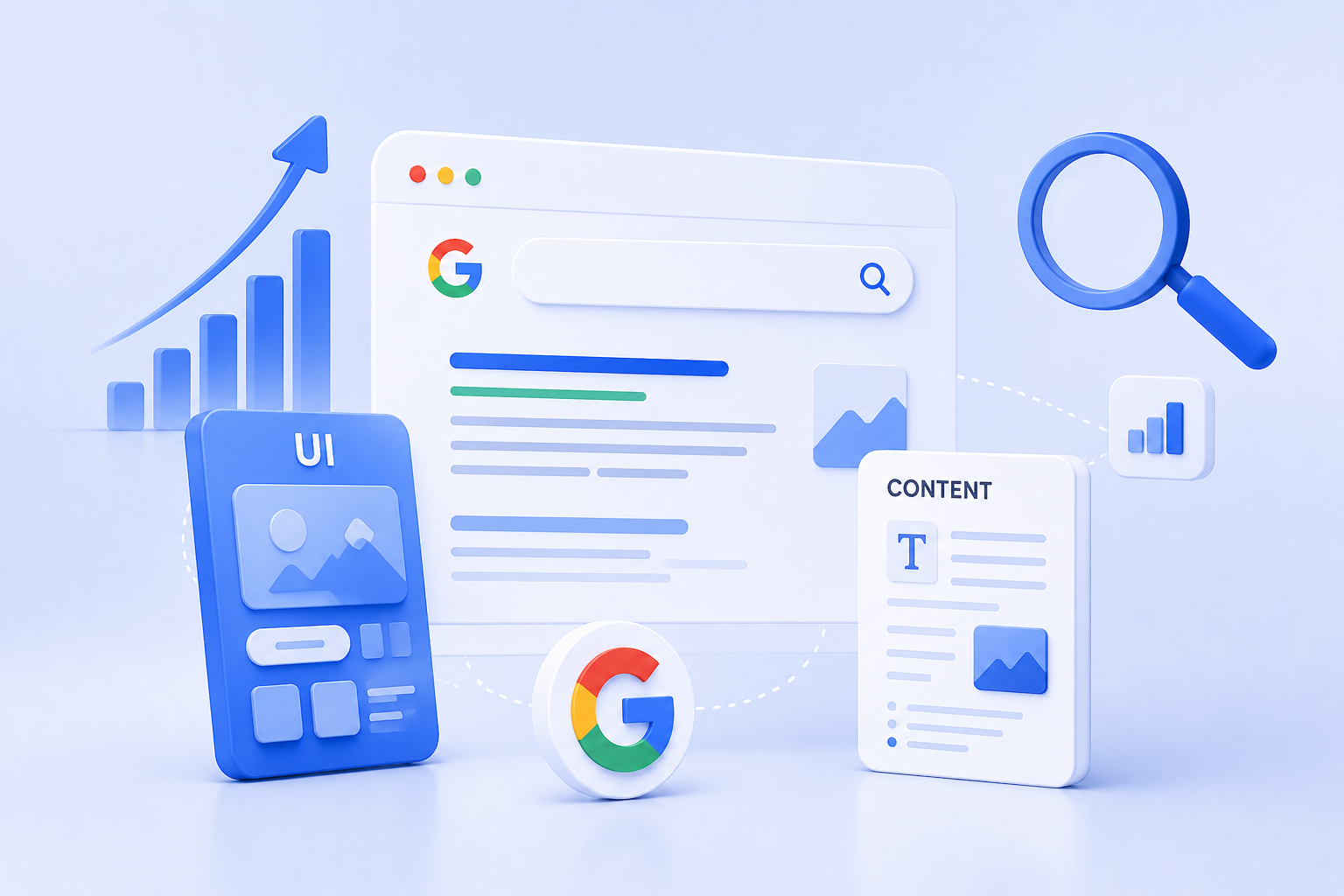
Designing for Google: How UI and Content Work Together for SEO Dominance

We often think of SEO as a purely keyword-driven game — a matter of search terms, backlinks, and metadata. But in 2025, SEO is no longer just about ranking higher. It’s about delivering value once you get there. That’s where UI/UX design and content strategy step in as powerful allies.

If your website ranks high but users bounce quickly, Google takes notice. If people stay, engage, and convert, you win — both in rankings and in business. So, how do you get there?

Let’s decode the secret sauce: a design-content symbiosis built for SEO dominance.

1. SEO Isn’t Just Text — It’s Experience

Search engines have evolved. Google now evaluates a mix of Core Web Vitals, page structure, mobile responsiveness, and user intent satisfaction — all of which tie back to design.

Yes, content still needs keywords. But without a clean, intuitive interface, that content won’t be read, shared, or converted.

Great SEO today is built on how users experience your content — not just how robots crawl it.

2. Design Helps Google Understand Your Content Hierarchy

Here’s how thoughtful UI supports SEO architecture:

  • Headings (H1–H6): Clearly designed typography and spacing improves skimmability for users — and crawlability for bots.
  • Button hierarchy: Consistent CTAs (calls-to-action) in design reinforce desired actions — from clicking “Learn More” to signing up for a newsletter.
  • Breadcrumbs and navigation: Help users (and Google) understand site depth and context.

Your layout isn’t just a visual choice — it’s an information architecture decision. When your site is easy to use, it’s easier to crawl and rank.

3. Content Drives Context — But Design Drives Readability

You can have the best-written blog post in the world, but if it’s cramped in long paragraphs or poorly formatted, users will leave. That’s why design elements like:

  • Whitespace
  • Font hierarchy
  • Contrast and accessibility
  • Scroll pacing with visual breaks

…play a massive role in how long users stay and how far they read — key engagement metrics Google watches closely.

Design doesn’t just beautify. It makes content consumable.

4. Mobile UI/UX is No Longer Optional

With Google’s mobile-first indexing, responsive design is a non-negotiable. But beyond fitting the screen, your design needs to adapt the experience:

  • Ensure that menus are thumb-friendly
  • Keep CTAs clearly tappable
  • Avoid intrusive popups or slow-loading assets
  • Use collapsible sections for long-form content

A poor mobile design increases bounce rates — and that hurts rankings.

Microinteractions and Visual Cues Improve Dwell Time

When users interact with your design — hover effects, animated scrolls, tab reveals — they’re engaging longer.

Design elements that improve:

  • Time on page
  • Scroll depth
  • Interaction rate

…signal to Google that your content is not only relevant but also valuable.

Imagine a product page with strong SEO copy but no visual trust signals, awkward spacing, or confusing navigation. Now flip that: a beautifully designed page with vague or thin content. Both fail.

But when your designer and content strategist work together:

  • You craft structured, scannable, strategic content
  • You design layouts that highlight what’s most important
  • You create a site that not only gets found but turns visitors into believers

Design for people, write for people, and structure for people — and Google will reward you for it.

In today’s digital game, SEO success doesn’t live in a silo. It lives where content, design, and UX meet. The websites dominating search results in 2025 are those that understand this synergy.

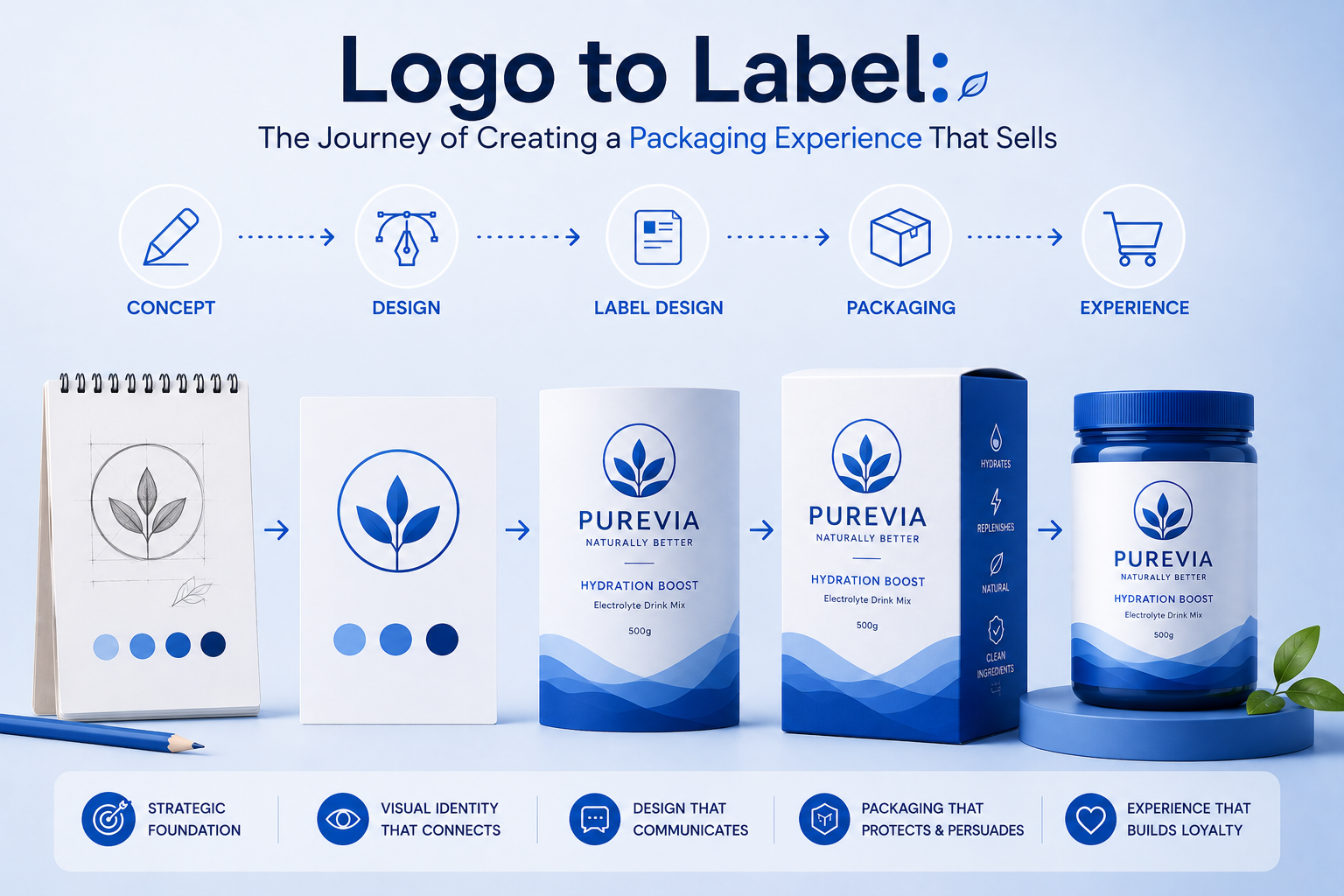
Logo to Label: The Journey of Creating a Packaging Experience That Sells

In the sea of product shelves — both physical and digital — packaging is more than a container. It’s a handshake. It’s a billboard. It’s the only salesperson your product has before someone even tries it.

While a strong logo builds recognition, it’s the full packaging experience that builds desire, emotion, and trust. From dielines and finishes to typography and storytelling, every inch of your label is a chance to sell without saying a word.

So how do we go from a flat logo file to a full-blown packaging identity that moves off shelves?

Let’s walk through the journey.

Packaging isn’t just about “looking good.” It’s about understanding:

  • Who you’re selling to
  • Where the product will sit (online, retail shelf, luxury boutique?)
  • What emotion you want to trigger

Before a designer opens Figma or Illustrator, we define positioning. Is your brand playful? Premium? Purpose-driven? Sustainable? That clarity determines every creative choice moving forward.

Your logo may look great on a website or business card — but can it scale down to a tiny label? Can it work in foil or embossing? Does it hold up in monochrome for regulatory print applications?

A good packaging system includes:

  • Primary logo lockup
  • Stacked or horizontal variations
  • Monogram or icon versions

Adaptability ensures brand consistency across formats — from pouch to bottle to shelf-ready box.

Every product comes with constraints: size, shape, surface, material. Your dieline is the blueprint of that surface.

Think of dielines as the stage for your design. It includes:

  • Bleed areas
  • Safety margins
  • Fold/crease marks
  • Regulatory compliance zones (especially for food, cosmetics, or pharma)

Designing within — and often creatively around — these boundaries is the difference between amateur packaging and professional shelf appeal.

Colors and fonts don’t just decorate — they communicate.

  • Earth tones + serif fonts = eco-conscious, organic
  • Bright pastels + rounded fonts = youthful and friendly
  • Monochrome minimalism = luxury and premium positioning

The typeface hierarchy (headlines, body copy, product descriptors, net weight) should feel natural to read — and aligned with your brand’s tone.

Legally, your packaging must include a lot of info — ingredients, barcodes, instructions, batch numbers.

But the challenge is making this functional data look elegant.

Use:

  • Icons for instructions
  • Grid layouts to organize info cleanly
  • QR codes for extended storytelling or product origin tracking
  • Design-led back panels that don’t feel like afterthoughts

Information should never feel like a distraction — it should enhance trust.

How a product feels in someone’s hand affects how they perceive it.

Options include:

  • Matte vs gloss finish
  • Embossing/debossing
  • Foil stamping
  • Sustainable or recycled stock
  • Minimal ink for a raw, natural feel

Packaging is tactile branding. Make it worth the touch.

Once the design is ready, we test:

  • 3D mockups in real-life scenarios
  • Shelf comparison against competitors
  • Distance readability — can someone recognize the brand from 3 feet away?

This testing ensures your packaging not only looks good up close, but also performs in a fast-paced buying environment.

Your logo starts the conversation. Your label continues the story. The entire packaging experience — from unboxing to recycling — shapes the brand memory.

In today’s world, where social sharing, sustainability, and sensory delight are expected — packaging isn’t the end of branding. It’s often the most visible beginning.